Writing for People, Not Doctors: How to Communicate with Potential Trial Participants
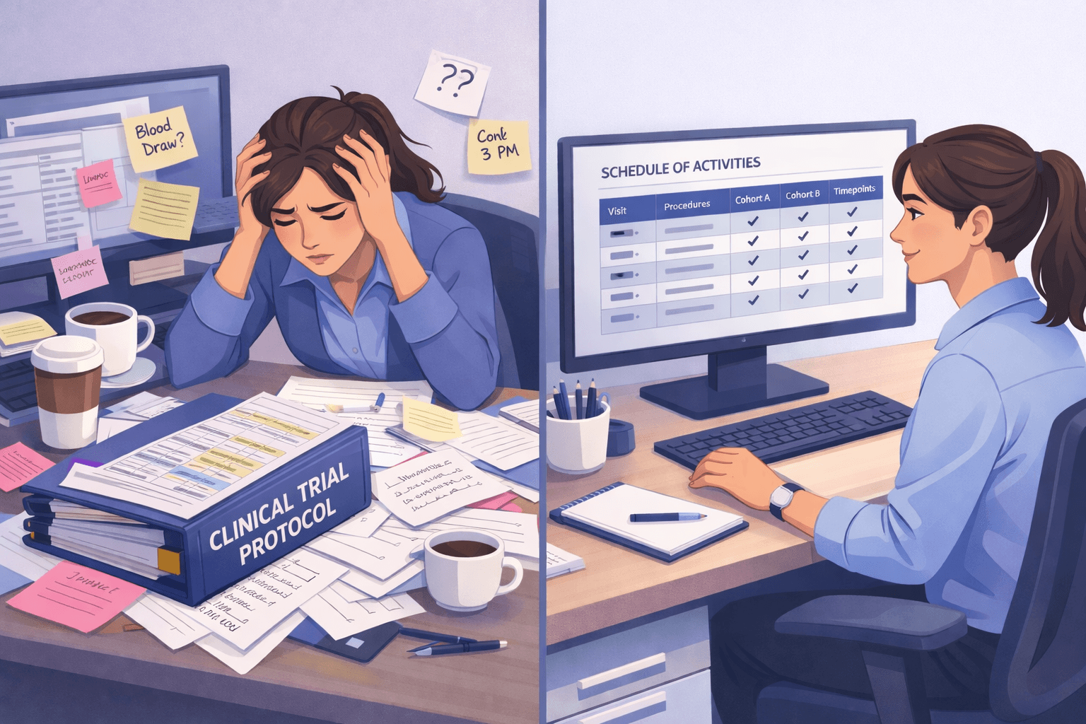
A few days ago I sat down with a clinical research team to review a study landing page, the kind built for a pediatric trial, where a parent, not the patient, makes the decision to enroll. The team had done real work on it. It was thorough, accurate, and complete. It was also, on a phone screen, broken: buttons the same color as the background, sentences running off the edge of the card, a headline that took two full paragraphs to say what it meant.
The instinct in that room was to treat it as a formatting problem. Shrink the font, adjust the padding, fix the button color. But the formatting was not the problem. The content was. A landing page written for a doctor will always look wrong on a phone, no matter how much you adjust it, because it was never built for the person who is actually going to read it there, standing in a school pickup line or scrolling before bed, deciding whether this is worth two more minutes of their time.
That is the real subject of this post. Communication, not layout
Who is actually reading this page?
Every clinical trial landing page has two possible audiences, and most drafts are written for the wrong one. One audience is clinical, people who read protocols for a living and want precision, completeness, every inclusion and exclusion criterion accounted for up front. The other audience is a parent or a patient who has, at most, come from an ad or a referral, has thirty seconds of attention to give, and is asking one question: is this relevant to me, and can I trust it?
These two audiences need almost opposite things. The clinical reader wants density. The participant wants clarity. A page that satisfies the first will, by definition, overwhelm the second, and an overwhelmed reader does not read more carefully. They leave.
The research on this is consistent and worth taking seriously rather than treating as a nice to have. A cross sectional survey found that three quarters of parents are open to enrolling a child in a clinical trial, but two thirds are wary of an experimental treatment without prior information given to them clearly. A separate randomized trial found that plain language versions of health material did not just make parents feel better about the material, it measurably improved their actual understanding of what was being recommended. And qualitative research into parental decision making around pediatric trials found that trust and transparency about risk and benefit, not convenience, not compensation, were the deciding factors in whether a parent said yes.
Put simply: the audience is not being difficult by wanting things simple. Simple is what actually works.
The one sentence test
The single most useful discipline I know for this is what I call the one sentence test. Whatever sits at the very top of your landing page, above the fold, before anyone scrolls, has to work as one sentence. Not two. One.
This sounds like a small constraint. In practice it is the constraint that forces every other decision. If you cannot say what the study is and why it matters in one sentence, you have not yet decided what the study is about in a way a participant can use. The two paragraph version is not more informative than the one sentence version, it is just less decided.
A good test sentence does two things at once. It should let the reader recognize themselves, and it should imply the benefit without overpromising it. Something like: could a new study help stop your child's developing teeth cavities before it causes problems. That single line tells a parent/Caregiver who has already been told their child has a developing tooth cavity that this page is for them, and it frames the study around an outcome they care about, without promising a result the data cannot yet support.
Or could a daily pill help manage the day to day challenges of Alzheimer's disease. That single line tells a reader who already recognizes those day to day challenges that this page is for them, and it frames the study around an outcome they care about, without promising a result the data cannot yet support.
Everything beneath that sentence should follow the same rule at a slightly larger scale. What is this trial about, in a short paragraph, not four. What are the benefits, framed honestly as potential improvement rather than promise, because that is both more accurate and, done well, more credible. A simple picture of the trial process, how many visits, how long, so a family can picture the commitment before they agree to it. A plain statement of who can take part, without the exclusion criteria and safety detail that belongs in a screening questionnaire, not a landing page. A short paragraph on who is running the study and why they can be trusted. And, if you have them, the actual locations where a family can go, because knowing a study is real and physically reachable does more for trust than another paragraph of reassurance.
Where AI genuinely helps, and where it does not
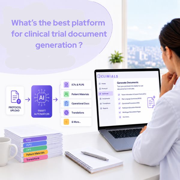
Part of what made the working session productive was a set of AI generated documents using Clinials templates that exist specifically to solve this translation problem: a protocol to marketing plan report that turns a dense protocol into ad copy, outreach scripts, and recruiting messages, and a plain language synopsis that restates the entire study in the register a participant actually reads in. Used well, these become the source material for the landing page, not an afterthought generated after the page is already written in clinical language.
I want to be precise about what this replaces and what it does not. It replaces the week of drafting time it used to take a team to translate a protocol into participant facing language from scratch. It does not replace the judgment of the person who knows the study, the site, and the audience, and who has to decide what actually belongs on the page versus in the eligibility questionnaire further down. The draft should arrive fast. The decisions about tone, emphasis, and what to leave out still belong to a human who understands both the science and the parent reading it.
A short, honest checklist
If you are reviewing a participant facing page today, four questions will tell you most of what you need to know.
Does the top of the page pass the one sentence test.
Does every section read like it was written for the person clicking the link, not the person who wrote the protocol.
Have you separated what a parent/caregiver needs to decide whether to click through from what belongs in the screening questions.
And have you actually looked at the page on a phone, because that is where most families will meet it.
None of this is about dumbing anything down. It is about deciding, on purpose, who you are writing for, and then writing for them.
A parent or caregiver deciding whether to enroll their loved one in a study deserves clarity, not density. Give them that, and the formatting tends to take care of itself.